I punch in the attendance figures every week, and today it just hit me that this looks kind of cool!!
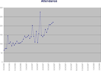

I punch in the attendance figures every week, and today it just hit me that this looks kind of cool!!

Race and the Gospel: Is Justice a Part of the Discussion? Originally appeared in Outreach Magazine Good news, like light, touches everything in the room.
Taken from Tamara’s favorite devotional, Bread For the Resistance, by our friend Donna Barber. Copyright (c) 2019 by Donna Marie Barber. Published by InterVarsity Press, Downers
The God of Justice “The Lord’s justice will dwell in the desert, his righteousness live in the fertile field.” Isaiah 32:16 The God of Disruptive

Has the thought of doing a daily devotional ever felt similar to the feeling you get when you think about doing your taxes: You know
